

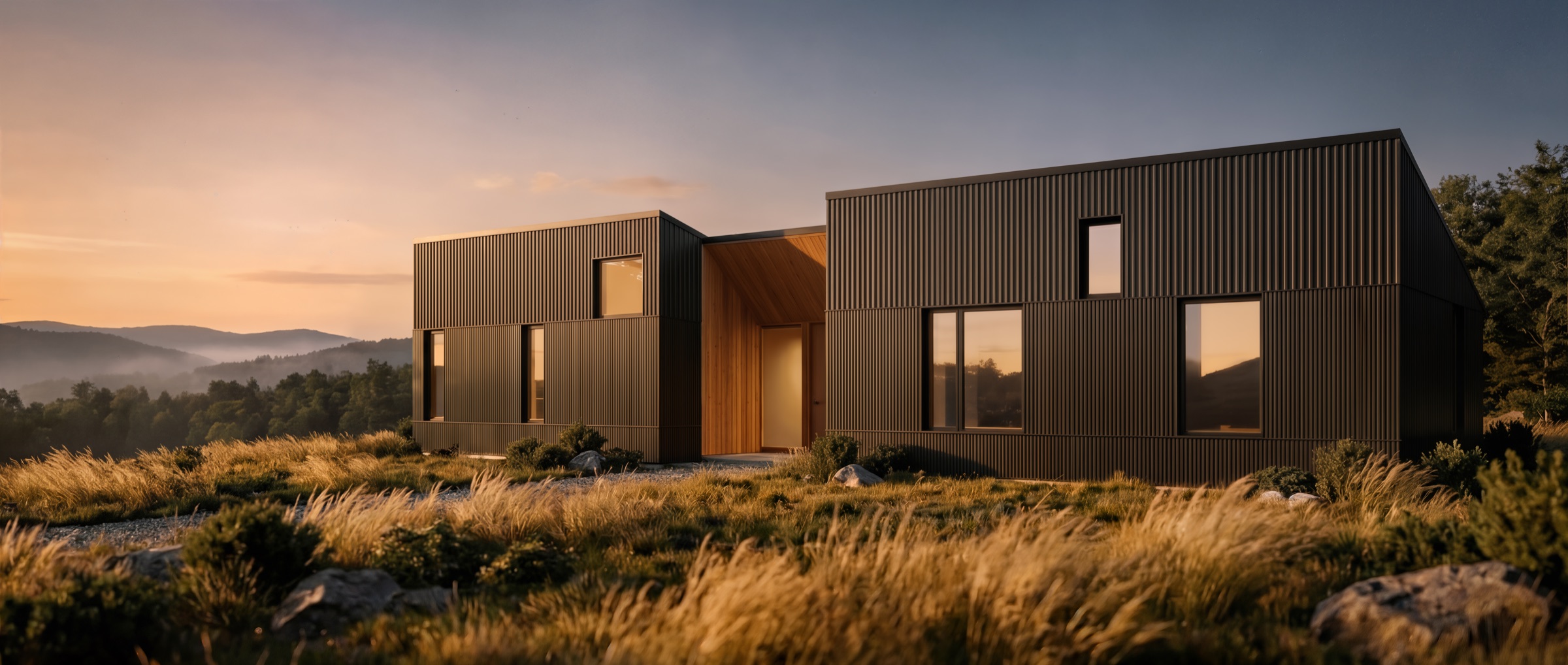
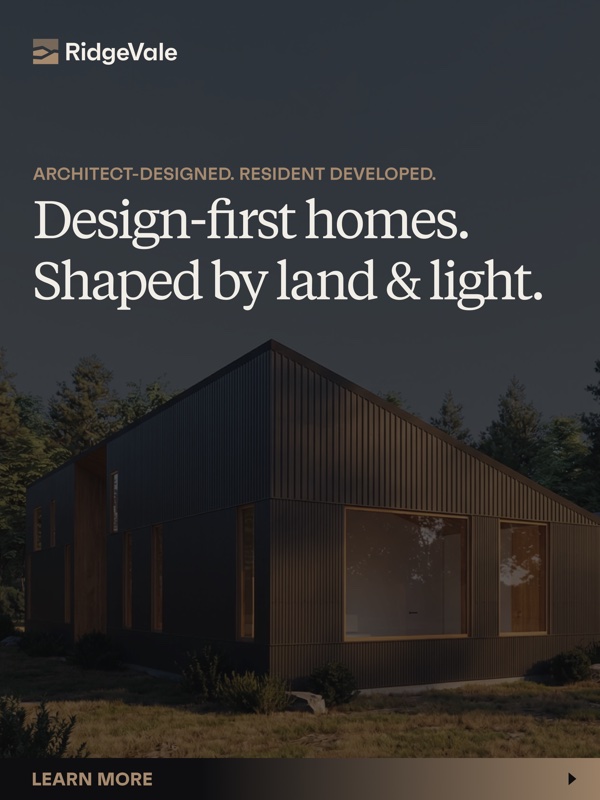
Ridge crest · Catskill horizon
Set on the highest clearing, with filtered views toward the Catskill horizon.
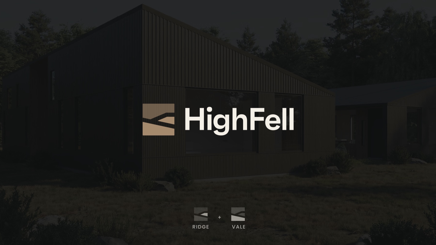
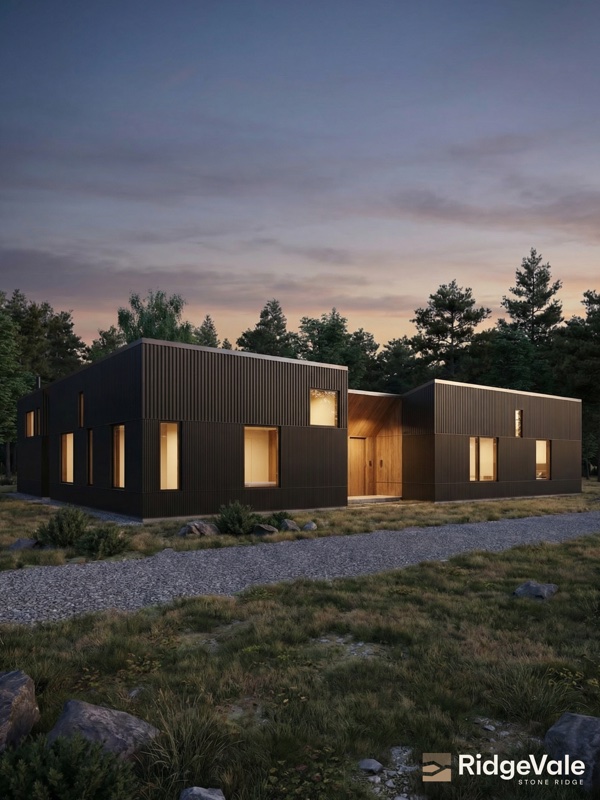
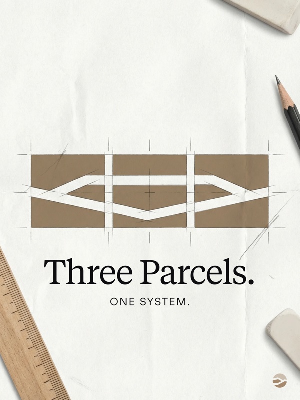
Three architect-designed residences on a ridgeline in Stone Ridge. Engaged pre-architecture. Named, positioned, launched, and compliance-audited twelve months before the first listing goes to market.
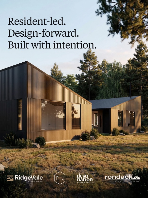
A ridgeline in Stone Ridge. A partnership with INC Architecture & Design. A builder in Rondack Construction. Three residences, still on paper, a year or more from market.
The architect was drawing. The builder was scoping. What would eventually sit on the land needed a reason to exist before it had a spec sheet — and the brand had to come first, or the brand would never catch up.
We were brought in before the foundation design was locked.

For a pre-listing, pre-construction project at this price point, the typical real estate approach — specs, floor plans, pricing up front — filters out more buyers than it attracts. The right buyer at this stage isn't comparing sheets. They're responding to a feeling.
We built a phased-disclosure model instead. Phase one is emotion, identity, and intrigue: no pricing, no timeline, no floor plans — a site calibrated to make the right person want to know more, not to answer every question. Phase two brings structure: lot pages, specs, site plan, pricing ranges. Phase three is transactional — MLS, brokerage, the paperwork.
The thesis is simple and it holds: what you leave out is as important as what you include. Strategic omission creates desire. Not knowing is a form of I don't want to miss it.
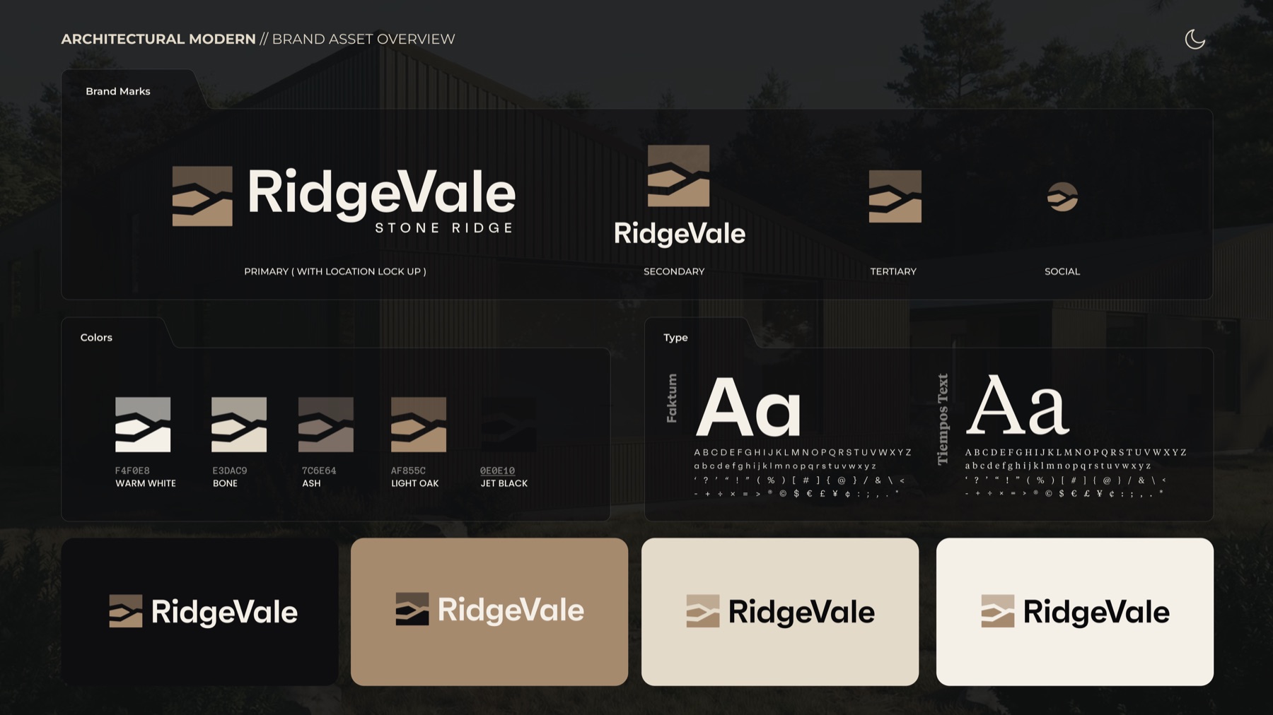
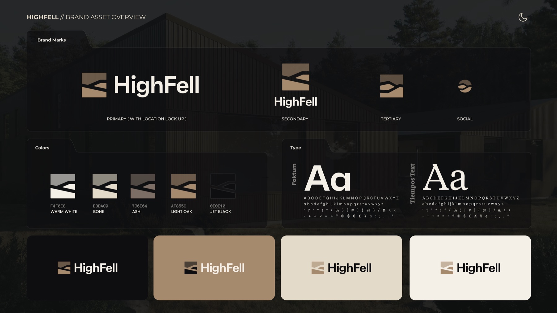
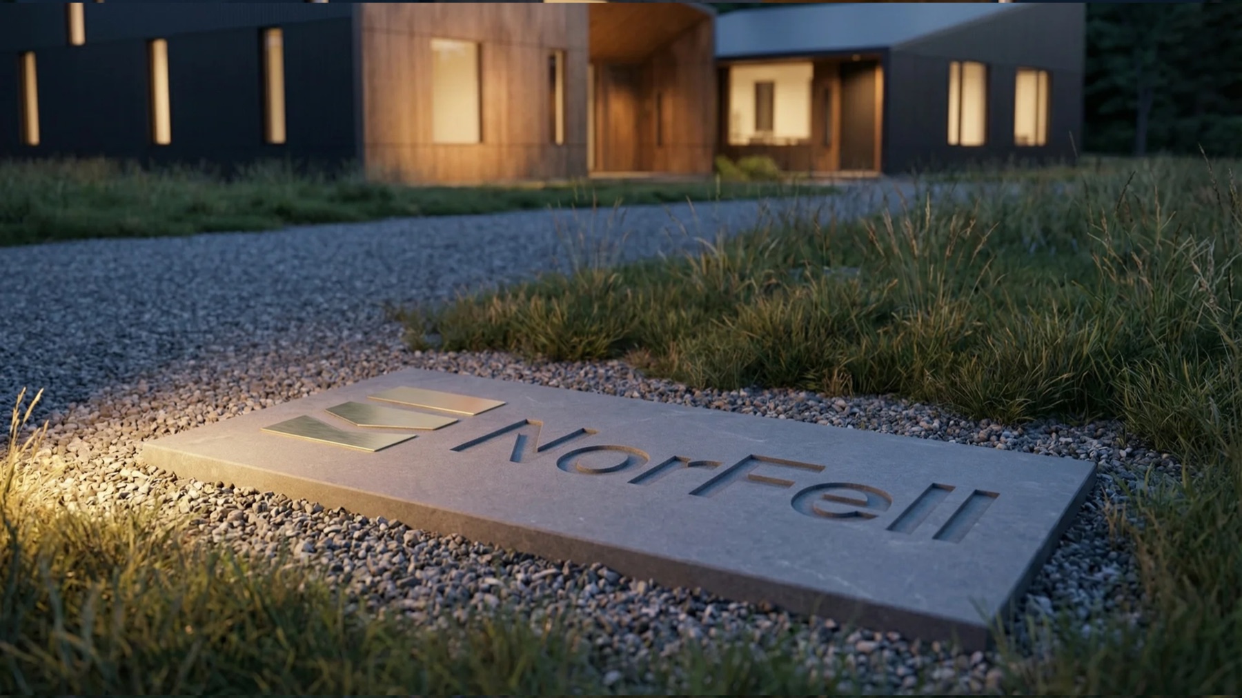
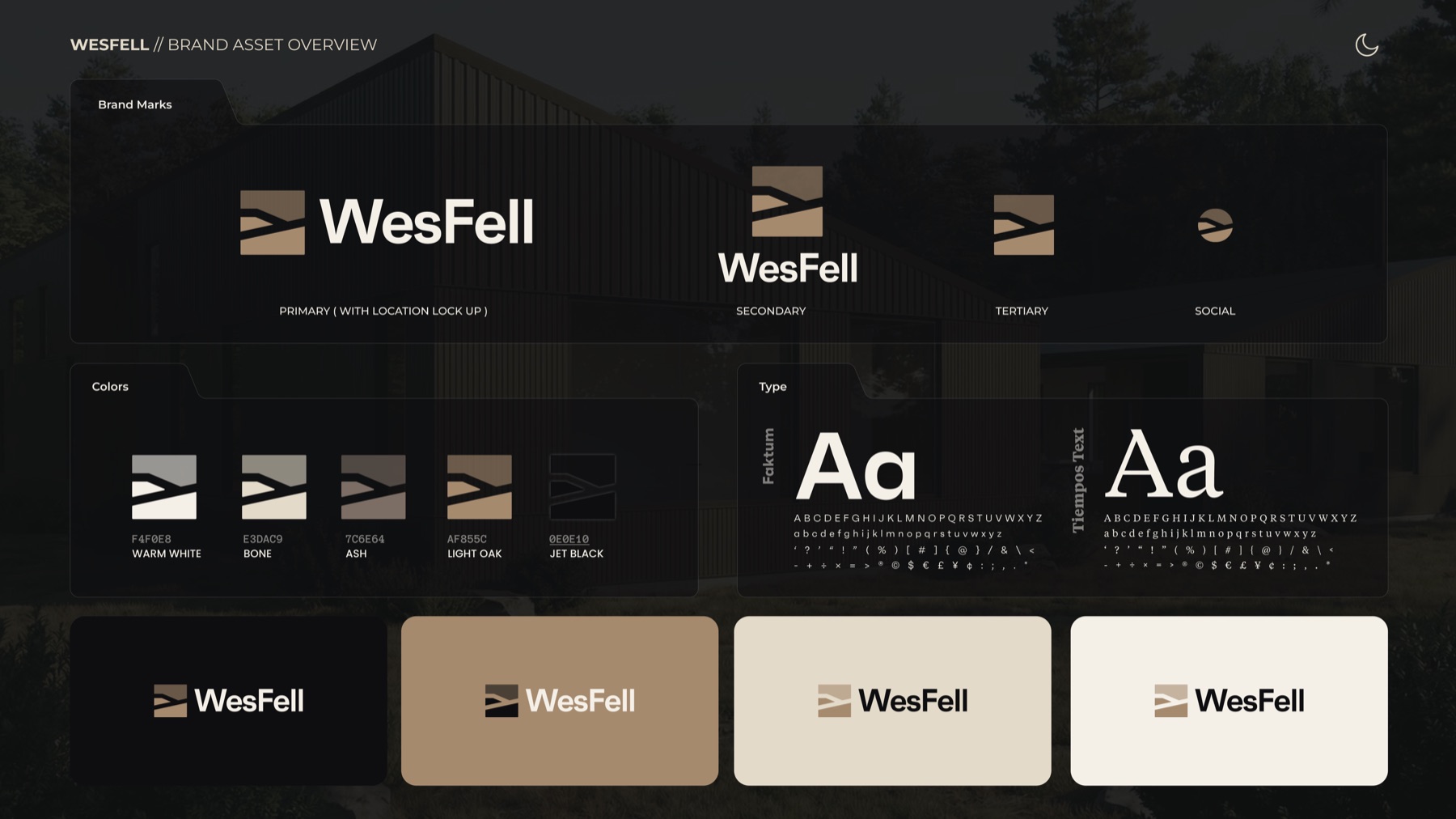
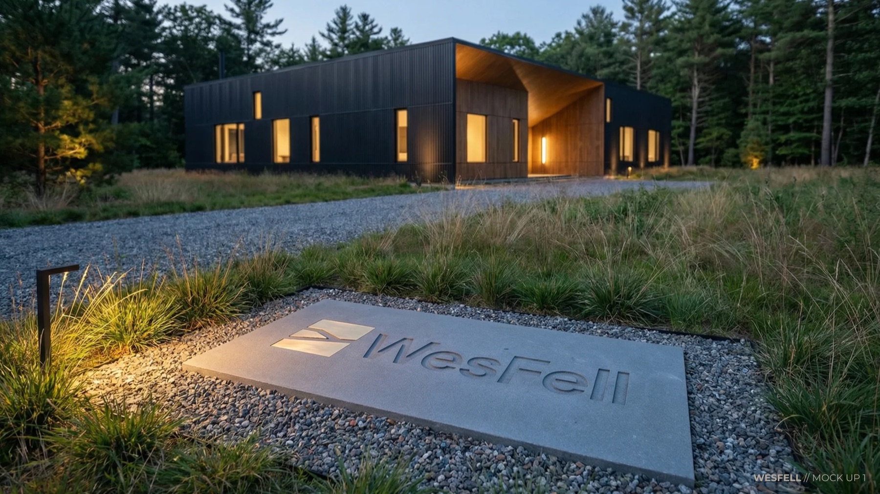
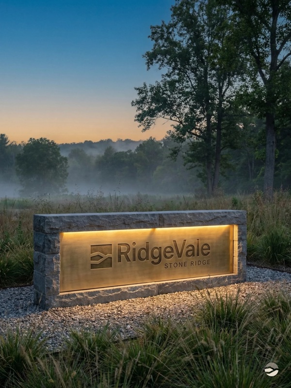
A wordmark with the restraint of a property, not the gloss of a spec build. A six-colour palette anchored by oak and jet, borrowing from the land without becoming a rustic cliché. Two typefaces — DM Sans for clarity, Source Serif 4 for gravity — that could sit on signage, on a contract, or on the spine of a book without feeling out of place in any of them.
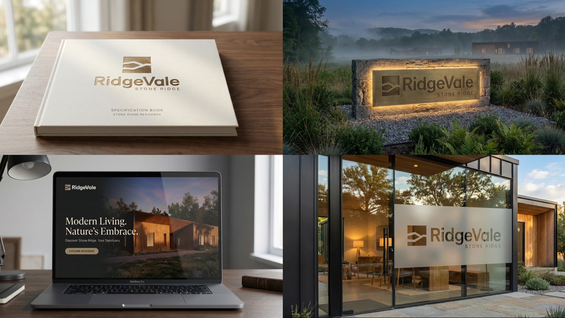
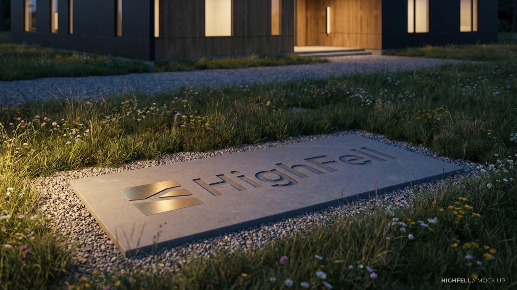
Design tokens, not just design decisions. The system exists in code the same way it exists on a moodboard, so every future surface — a brochure, a gate plate, a broker deck, a signature line on an email — inherits the same quiet discipline.
What follows is an abbreviated walkthrough of the identity presentation — the objective, the system, the selected direction, each lot, and the recommendation.
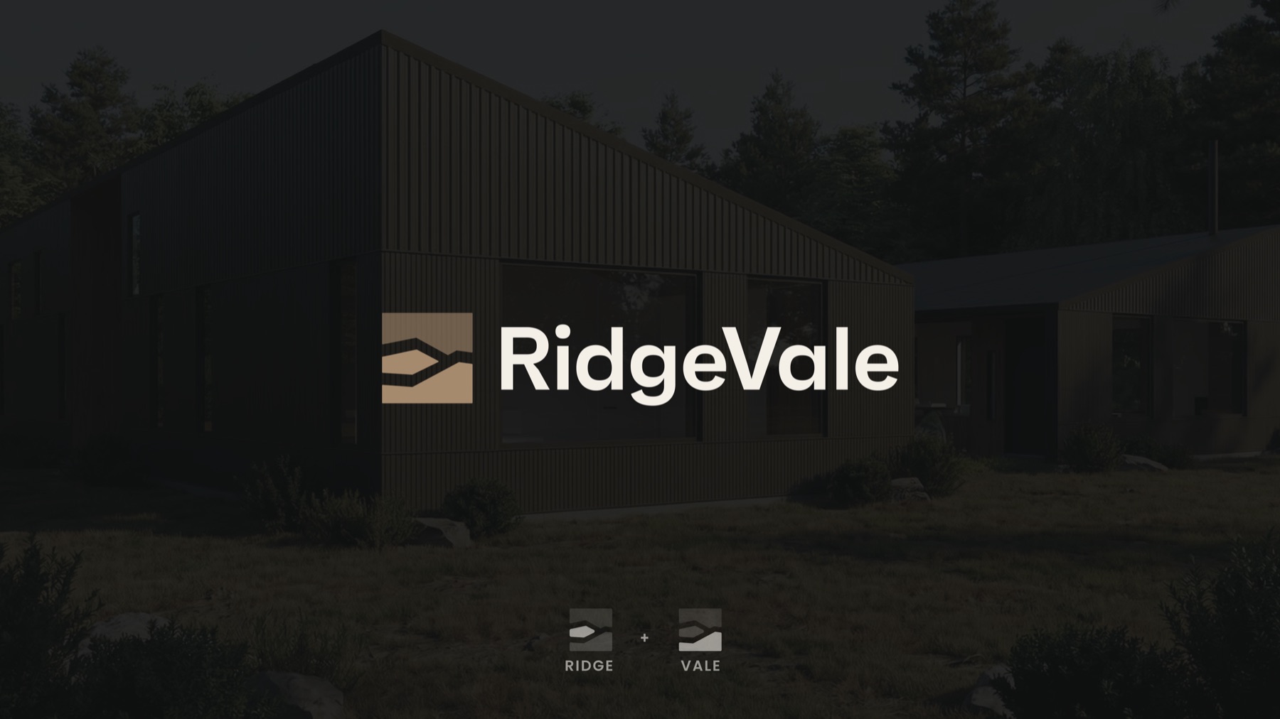

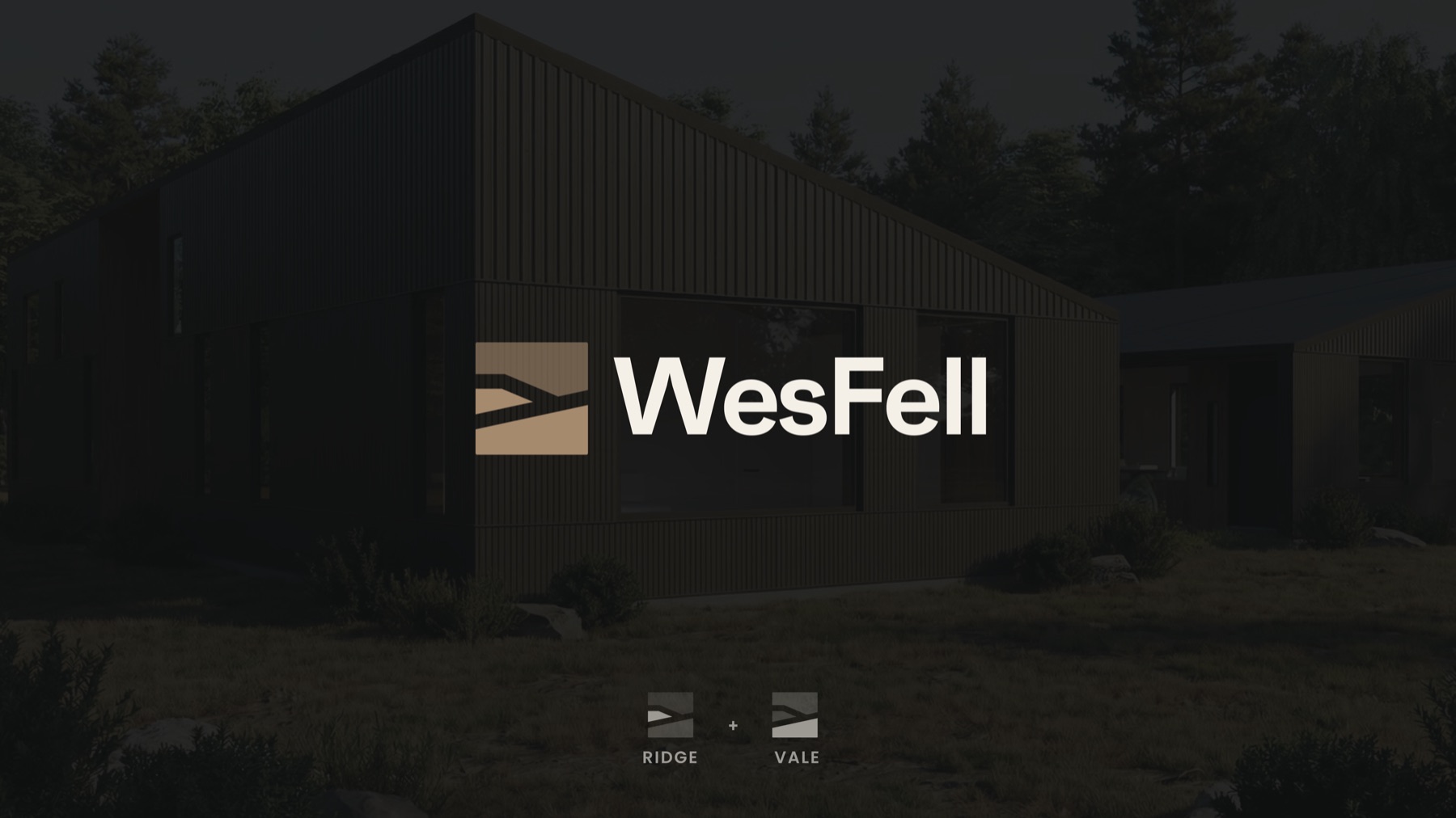
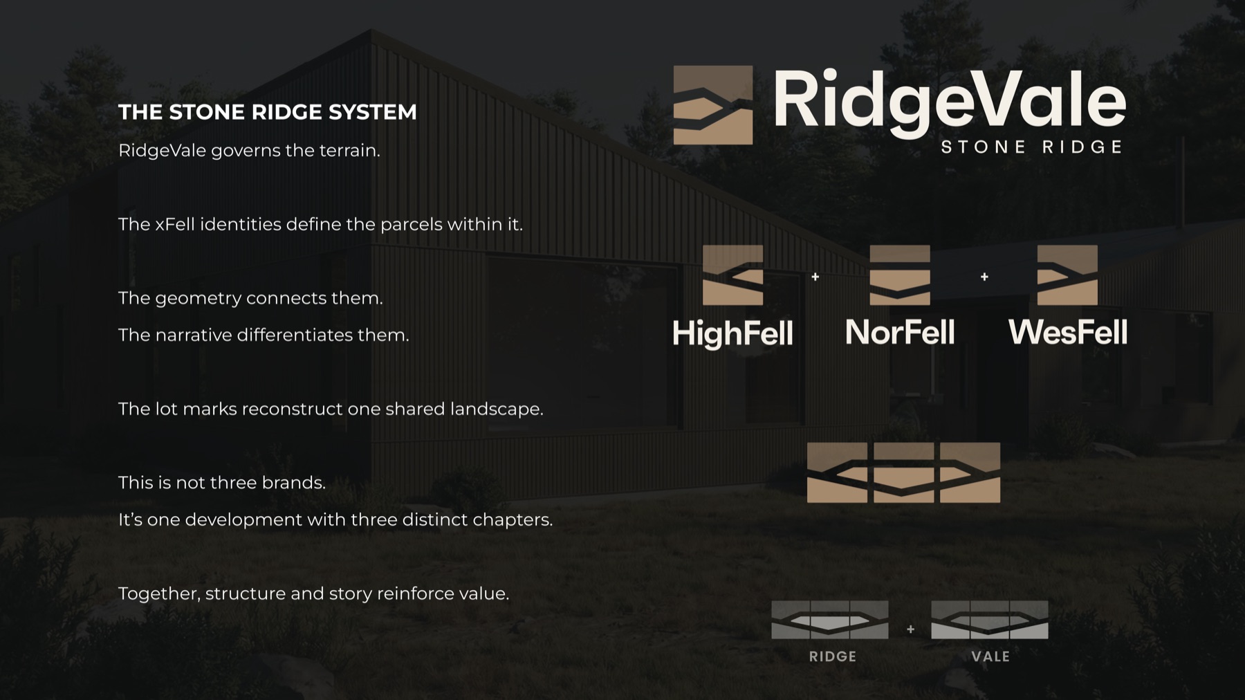
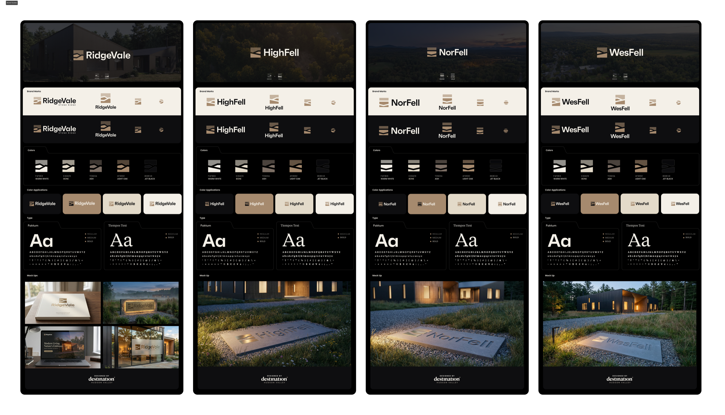
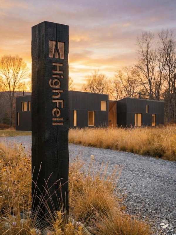
RidgeVale reads like a place first and a development second. Geography anchors the story; the architecture gets to be the delivery, not the premise. Beneath it, the architectural language — ValeHaus — gives the residences a material vocabulary that can travel across signage, site plans, and legal documents without flattening.
Each residence carries a name drawn from its position on the ridge, and a register drawn from what the land actually does at that spot:
Set on the highest clearing, with filtered views toward the Catskill horizon.


Tucked beneath the tree line, where the land feels quieter and more held.


Set where the field opens west, and the evening light lingers longest.
None of these names are invented marketing. They are descriptive in the oldest sense — a language pulled from the land before the land was surveyed. That distinction matters: the names hold because they are true, not because they are clever.
Ridgevale.life is a single-page teaser. It does not have a CMS, a framework, or a page builder behind it — it is one file, hand-authored, and that is the point. Fast, portable, and fully controlled. The design is calibrated to one job: produce a mailing list of people who feel something when they see the project.
A golden-hour hero video. A scroll-triggered mailing list (not timer-based — we earn attention before we ask for it). A custom SVG regional map with editorial cartography instead of a Google Maps embed. An interactive distance calculator pre-populated with drive times from nine origin cities. Reveal animations behind a failsafe for fast scrollers. Responsive across three breakpoints. iOS video handling for Safari.
And behind it, a second site — password-protected, brokerage-attributed — for pre-listing use by the agent team. Two versions, one system, a clean separation between developer marketing and brokerage materials.
A mock-up of the teaser. Visit ridgevale.life ↗
Most real estate marketing treats compliance as something that happens after the creative — a legal review, a few disclaimers, a copy edit. That order of operations is where launches quietly go wrong. We treated it as a design input.
We ran a proactive audit against New York Department of State real estate advertising regulations (19 NYCRR § 175.25) before a line of copy was published. We softened lot descriptions that could read as compass-specific claims. We removed references that could imply ownership of the broader parcel. We flagged Martin Act and Offering Plan considerations for counsel — not as a blocker, but so the team could move without surprises.
The more interesting problem was NAR Clear Cooperation. A public, unattributed developer site can carry no broker branding without an MLS entry. A brokerage-attributed site at the same URL can trigger the clock — and once the clock is running, so is the listing, ready or not. Our answer was the two-version architecture — a design decision, not a legal workaround.
Compliance did not slow this project down. It sharpened it.


They didn't treat us like a listing. They treated us like a brand — before we had a brand. That changed everything about how we're going to market.
Draft testimonial — pending approval from Jimmy.
RidgeVale is ongoing. The full outcome will eventually be written in closings. What is already in place, months before the first listing goes live: a name, a narrative, a system, a buyer profile, a phased model, a live teaser site, a compliance-cleared foundation, a launch-ready social feed, and a developer who is no longer starting from zero.
When the listing exists, it will not be competing with every other new-build in the Hudson Valley. It will be arriving as a brand that already means something.
This is the work. Upstream. Intentional. Shaped before sold.
Engaged early, a brand sits upstream of the architecture, the compliance, the listing — and by the time the work goes to market, it has already done half of its job.
If you are about to build, about to launch, or about to list, we take on a small number of engagements each year. A conversation is the first step.
Start a Conversation →